
When you're sharing data in a presentation there are two key rules to follow:
- Focus on your audience�s needs.
- Keep things as simple as possible.
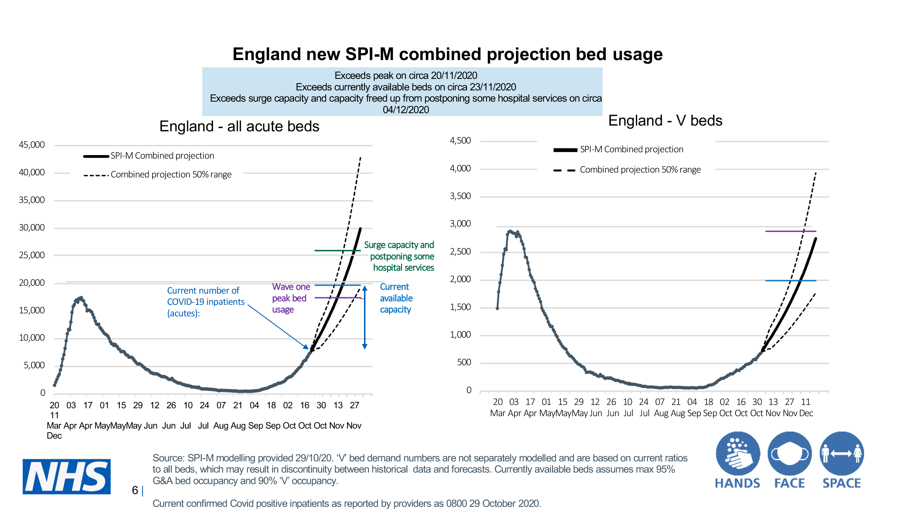
The UK's Chief Scientific Advisor, Sir Patrick Vallance, failed to follow either when he shared this slide during a government press conference on the evening of Saturday 31 October last year:
This pandemic press conference was one of many where Vallance or other scientific colleagues provided much-needed data and expert insight about infection rates and risks. In general, I have nothing but praise for the clear and considered manner in which these scientists and medics have shared and interpreted data, while consistently reinforcing life-saving messages.
This day, however, was different. It was the moment when UK Prime Minister Boris Johnson announced a second England-wide lockdown. The public needed to be on board and the data needed to be as clear, comprehensible and compelling as possible. Instead, we got this visualisation, which Vallance introduced by saying, "This is a complicated slide".
The point Vallance wanted to make was that the National Health Service (NHS) would run out of capacity if the country didn't enter lockdown. And that people would die unnecessarily because of that lack of capacity. Unfortunately, none of this is immediately obvious from the slide.
Let�s look at some of the things that make this so 'complicated':
- The title barely makes sense, because it includes an unexplained acronym (SPI-M). It's also a missed opportunity to communicate something about the overall message.
- The layout feels cramped and overwhelming, because there are two graphs squeezed onto the same slide. The sheer amount of things included means the text ends up at a tiny, almost illegible, font size.
- The two graphs use different scales on both axes � so if you're tempted to compare the two, it's not a straightforward task.
- Each graph combines several different measures, including past (actual) data and at least three different projections. Each also has two or three markers, which highlight the actual number of Covid inpatients, the current bed capacity and a notional 'surge capacity' (if other hospital services were to be dropped). All together, this is a huge amount of information to absorb, even on one graph; here we have two.
- The slide contains plenty of 'chart junk', information which detracts from the main message and could be removed without sacrificing clarity or accuracy.
- The most important messaging (highlighting the dates when NHS capacity will likely be reached) is relegated to a small text box.
All this makes me feel like Vallance was sharing the visualisations that helped he and his colleagues understand the data and make predictions, visualisations that were designed to pinpoint key dates for experts. What he should have been doing was sharing visualisations designed to help the public understand the issue at a glance, while focusing on the key message: if we do nothing, the NHS will run out of beds and people who would otherwise have been saved will die.
Of course, modelling infection rates and hospital capacity issue is a complicated issue, but the slide needn't have been complicated too. Vallance should have known better. And so should we all. So, if you ever find yourself with a slide that looks complicated to you � a specialist in your field � just imagine how it looks to a non-specialist. Remember this cautionary tale and cut that slide from your presentation. Instead, invest the time to think through the purpose of the slide, before designing a straightforward visual that delivers your message while matching your audience's needs.
Anna Faherty is an author for accountingcpd. To see her courses, click here.
You need to sign in or register before you can add a contribution.